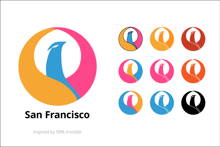
A new flag for San Francisco
I was binge-listening to that most fabulous of design podcasts, 99% invisible, and came across this analysis of San Francisco's flag and how terrible it is. I looked around, and found only one attempt at redesign, which I found unsatisfactory.
So here is an attempt to come up with a modern design. Principles: simple easily recognizable shapes, color and usage flexibility, and a nod to history (phoenixes, the ocean, wordliness, boom town/gold rush, lgbt rights, web design).

